Dow And Silver Bottoms Are In: A Story Of Sentiment
You can also view this article on investing.com which was published on May 24, 2022 01:28AM ET.
Dow
The Dow Jones has bottomed. This conclusion is based on technical analysis and sentiment. Five of the market’s major fundamental concerns are summarized later in this report.
Four decades of experience in technical analysis has kept me level-headed during times of nasty news. That said, let us look at how the news can support a bullish advance and the extent to which it may do so.
The Oct. 25, 2021 report forecast a peak that was only a stone’s throw away, though the breakdown only occurred this year. It was inferential reasoning that had served as the basis on which I had targeted a top at ~36,000.
The explanation was that a 50% collapse that would only slightly make a new low below 2020’s bottom would stop the advance at ~36,000, since major collapses are about 50%.
A minor break of the 2020 low was my analysis 7 months ago, based on the analyses of multi-decade indicators.
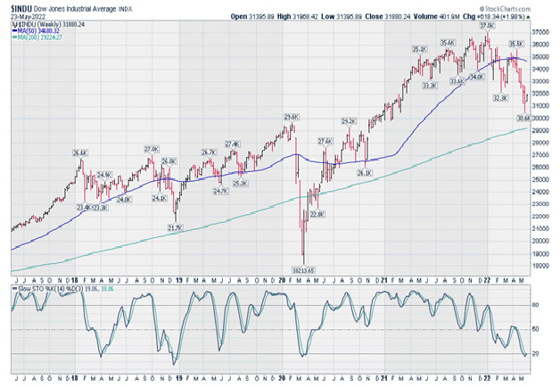
Let us look at sentiment and a 5-year chart of the Dow Jones.
Sentiment
The CNN Fear and Greed Index hit 6 last week, a ridiculous level achieved at the end of 2018 and at the March 2020 pandemic low. In the former case, the indicator did not subsequently peak until the very end of 2019. The bears had been driven through the mud.
After the sentiment indicator’s low in March of 2020, it subsequently topped with the Dow just after the publication of the report that is linked in the 3rd paragraph above (the sentiment indicator had also peaked in late 2020).
Almost everyone who is bullish at this time seems to be saying that the rally will only be countertrend, before again reversing sharply in the face of today’s extensive list of bearish considerations; those factors include inflation, valuations, the reversal of the trend in interest rates, along with the threats of diseases and war rounding out most of the negatives upon which investors may focus.
It would be consistent with both the analyses expressed in the Oct. 25, 2021 report, as well as that scenario that would kill both the bulls and the bears, that the Dow only make a slight new all-time high by about 1%, before collapsing before reversing lower.
The shorts would be mostly out, and the bulls would be suckered into chasing the market to window-dress for the end of 2022’s first half.
Let me be clear about the fact that I am NOT presently projecting any time frame for the collapse to ~18,000. Nor am I claiming that I will necessarily be bearish in any major way as a result of a slight new high in the indices.
A move back to extreme bullishness would obviously help me return to the view that I had 7 months ago and at the peak in 2020. In 2020 I called for a 10,000-point Dow debacle but, this time, I am not yet citing any time frames.
In any event, as regards today’s possible news-supporting positive fundamentals, it could be the end of the affair in the Ukraine, or anything else (other than the Ukraine situation) that could possibly create an idea that inflation is a lesser threat than before; this would create a more bullish outlook for earnings.
An advance to minor new all-time highs in the equity indices could be triggered by any positive news pertaining to the 5 major negative fundamentals that appear in the 3rd paragraph under “SENTIMENT,” above. Such news could set-off the most bullish factor of all at this time, namely, the bears’ stampede to cover their shorts.
Short is what the players indeed are and one need look no further than sentiment, since the latter reflects what investors have already done—not what they plan on doing.
5-Year weekly Dow Jones chart
The fast stochastic (not shown) of the chart is in oversold territory, while the more important slow stochastic joined the fast stochastic in also hitting the 20-level today (under the price’s chart).
The fast stochastic has reversed and is now pointing higher; the slow version below will join the fast stochastic in reversing to point higher, unless the Dow moves sharply higher this week.
In any event, the new low in the weekly slow stochastic is comparatively unimportant; it is the daily stochastic that is much more significant, insofar as divergences and oversold or overbought readings are concerned.

5-Year Weekly Dow Jones Chart
The 200-week moving average has been sufficiently approached, to support the conclusion that long term stockholders have completed their profit-taking for now. Admittedly, however, the 4-year economic cycle does not mean that much anymore, as compared to yesteryear.
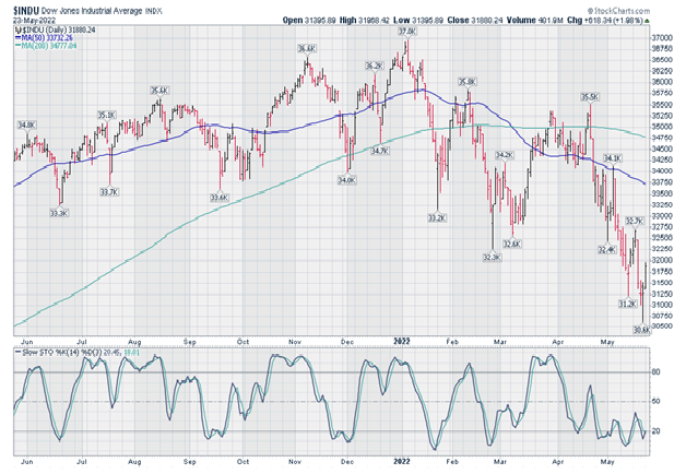
1-Year daily Dow Jones chart
As we can see from the chart immediately below, the fast stochastic has already given a buy signal. This is by virtue of its move back above 20 from an oversold condition, after not having made a new low with the Dow.
Regarding the more important slow stochastic, it also slipped under 20 without confirming the low in the market.

1-Year Daily Dow Jones Chart
Conclusion
The positives include favorable stochastic in both the daily and weekly charts, coupled with an extreme low in sentiment that is typically seen only at major troughs. Bears could chase the market to new highs, triggered by positive news concerning any of the five bearish factor cited in this report.
Strategy
Respecting that the negatives out there are indeed serious, and given that one can always run into a set of circumstances that may actually be “different this time,” however rare that such an occurrence may be, the “cowardly” course of action will remain the only strategy to which I would ever sign my name. Therefore, that approach is unchanged:
Since 2019, every report has advocated the same all-weather strategy and nothing else. At the perfect low in 2020, the here-linked Mar. 11, 2020 report provided greater detail of the Strategy’s formula.
As the rules-based methodology was developed over a significant period of time, the report focused on how one may seek steady income, within a strategy that aims to provide substantial leveraged protection against sharply negative quarters.
The preceding article coincided with the low in that year’s forecasted 10,000-point collapse. As with today, the report sought to explain how one may proceed when the terrain seems to be so filled with mines, as to make one too wary to move.
Such wariness is unnecessary, if one moves with wisely calculated prudence.
Silver
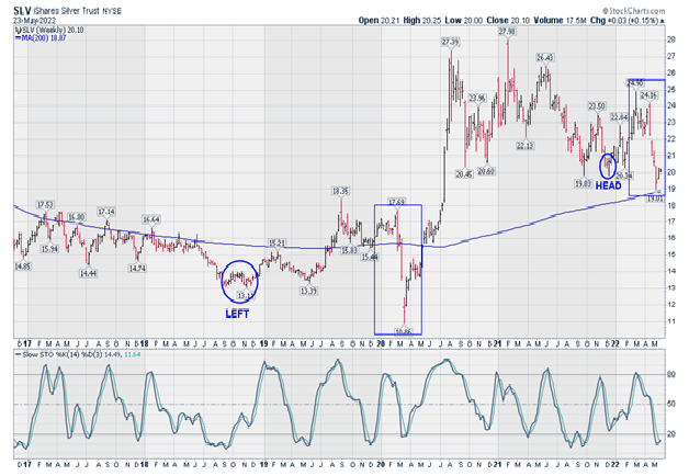
5-Year weekly SLV chart
Note that:
- A year and a half removed from the explosive 2020 run-up’s peak, the iShares Silver Trust (NYSE:SLV) came within 14 cents of the 200-week (4-year) moving average, suggesting that the long term holders have taken their profits and are out for now.
- The fast stochastic (not shown) is oversold and is now pointing up. The more important slow stochastic is also oversold and also looks like it wants to turn up.
- The annotations below indicate how standard technical analysis failed those who lived by inflexible rules. The annotations also imply observations that show how the crowd was, and is perhaps again being duped into selling.
Two periods are compared below, to contemplate if the major players are using the same gimmicks as they did in 2020 to flush-out the market:
4. Please note the circled annotation at the far left on the 5-year chart, “LEFT” (November 2018 – $13.17), which was the left shoulder of a shoulder-head-shoulder formation.
Now please note the rectangular box to the right of the circled low at $13.17. When the chart spiked through the head, which was higher than the left shoulder, and the bottom of which was May 2019 at $13.39, EVERYONE’S sell stops were triggered.
That 2020 spike low ($10.86) was actually the SLV’s right shoulder. There was nothing conventional about either the head or its right shoulder. However, this intuitive interpretation was supported by an analysis of the silver-related stock indices, as well as the stocks themselves.
Now please note the pair of annotated periods at the right:
The left shoulder is $19.83, with the circled head just a touch under $20.00, pretty much matching the left shoulder. By this analysis, we have again busted through the head, while coming within $0.14, as noted above.
5. Therefore, we are again seeing a formation in which the SLV has spiked below the annotated “HEAD” of a reverse shoulder-head-shoulder pattern.
As well, we can see that in the two annotated rectangles, each top-to-bottom move took about 2.5 months to form and complete. Or so, I am assuming.
This chart (SLV’s price action) just loves to fake out the crowd in the most inventive of ways, made possible by the relative thinness of the market when compared to gold, and particularly when also considered in the context of the buying power that the major players can exert when they so choose.
Forty years ago, my mentor taught me that rules should not be viewed rigidly, but, rather, should be used intuitively. In fact, one example that he had given me was that the right shoulder of a reverse shoulder-head-shoulder formation, could be lower than both the left shoulder and the head.
My friend did not have to add that this would more likely manifest in the case of an easier-to-manipulate market

5-Year Weekly SLV Chart
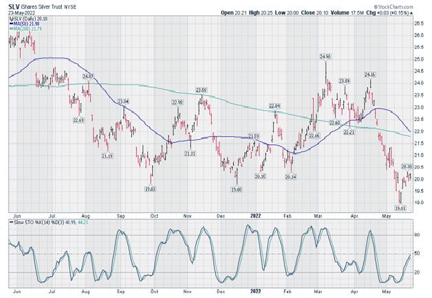
1-Year daily SLV chart
The undesirable aspects about this chart are that:
The 200-day moving average is pointing down, while the 50-day moving average is threatening to cross below it. As well, the fast and slow stochastic have shot up against a backdrop of comparatively little upward progress in the SLV’s price.
As regards the daily and weekly 1 and 5-year stochastic indicators, respectively, an ideal resolution for the bulls would be a minor new low in the SLV’s price, thereby dragging the daily stochastic down, without the indicator making a new low.
This would create a positive divergence that would align with the positives cited above with respect to the weekly chart and its indicators.
However, the market rarely makes it easy and is therefore rarely “ideal,” particularly where silver is concerned. Therefore, the risk and probability is that silver may have already seen its low.

1-Year Daily SLV Chart
Strategy
For an options speculator, I would recommend the SLV March 2023, 25-strike calls around ~$1.28, which was Monday’s closing offer.
There are lows that typically take place in the spring and fall, so, if things go wrong at first and one were of the mind to hang on, then one could benefit from 2 bottoming cycles.
This approach would be seeking to improve on probabilities in the aim to reduce risk, particularly since silver is known for explosive volatility when it gets going to the upside.
Note as well that time premiums are low. While the VXSLV data (time premium index on the SLV options) is no longer compiled and therefore does not appear anymore, the GDZ is still quoted. Historically, the two indicators have moved in lockstep.
