You can also view this article on investing.com which was published on Jun 27, 2022 02:31AM ET
Look Out Dow Below, And Watch For The Silver Streak
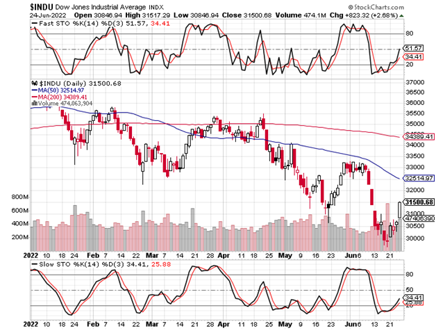
Dow
Look out for a Dow break below this month’s low; it could portend a significant and potentially swift drop toward 24,000. The near term upside resistance for the index is in the 32,200 – 32,500 zone. I have always watched for rallies (or declines lower, as the case may be) into gap zones.
Gap zones often represent areas where both bears and bulls suffer the most. Above the lower band of the rally’s resistance zone (~32,200), should it get there, many short sellers would be stopped out.
Meanwhile, those waiting to sell at the upper band (~32,500) would end up having to chase the market lower, in the event that the Dow would have reversed to the downside before getting to that higher resistance level.
Simply, a turn down from a point within a gap zone frustrates both those who are short, as well as those who seek to sell. In sum, turning lower from a point within a gap zone represents a worst-case scenario for both existent and would be short sellers.
The May 24, 2022 report identified a low from which, I forecasted, the Dow could double-top around its all-time highs. My reasoning was that most were looking for a counter trend rally at most, while there were those who felt that a new leg up was about to commence.
The short term low was correctly called, but the action since the point to which the Dow subsequently rallied indicates to me that the all-time high identified in the October 25, 2021 report will not be revisited.
3-Year Weekly Dow Chart
As regards the above discussion of gap zones, on the weekly chart immediately below, we can see that intra-June gap as having been closed; however, this is not the case on the Dow’s daily chart which follows it.
On the daily chart, we can see the 32,200 – 32,500 gap zone referenced in the first 3 paragraphs above.
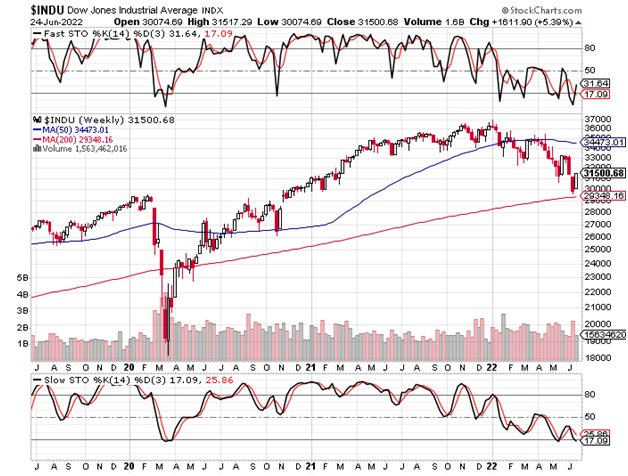
3-Year Weekly Dow Chart
6-Month Daily Dow Chart
6-Month Daily Dow Chart
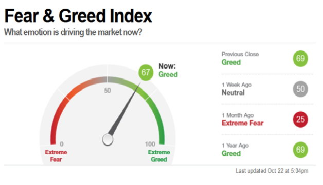
Before concluding, I should comment on sentiment. The CNN Fear and Greed Indicator included in prior reports had actually fallen to a ridiculous level of 6. The conclusions in the May report were largely influenced by that fact, as I noted history’s responses to such extreme levels.
I also wrote that acceleration lower would require that something would need to be very different this time, which is not ordinarily a good bet. However, we must examine how and why something could indeed be different this time.
The U.S. government, in the form of the Federal Reserve, along with the most substantial non-governmental interests that are close to them, represent the largest insider traders of all-time.
They have some keen awareness of future interest rate, inflation and economic policy trends. However, Russia was largely an unforeseen wild card.
It is possible that the latter x-factor (Russia/Ukraine) caused a need for the above-referenced insiders to hold up the market, in the face of the mushrooming non-military-related bearishness that was driven by the 3 factors cited in the preceding paragraph.
Holding up a market takes place so that insiders, including the largest investment banks, may line up their sell strategies. Since such strategies include delta hedging, the recipes for a speedy decline can be concocted; delta hedges include option strategies that hedge massive stock positions in the most efficient manner possible (the faster the decline, the greater the number of shares that are hedged since the program involves short term put options).
Do not be surprised if the type of dramatic selling that is described here is triggered by focus on news events coming out of the Ukraine.
Conclusion And Strategy
The Dow opened at 31,717 on May 24, 2022 so, no harm, no foul. Most importantly, however, and notwithstanding anything and everything else, bear in mind the strategy section of the latter report (linked in the paragraph immediately preceding the Dow’s 3-year weekly chart above).
Apart from the rules-based program’s purpose of generating meaningful returns following sustained bullish moves, the strategy is geared to generate sizeable double-digit returns following sharp declines.
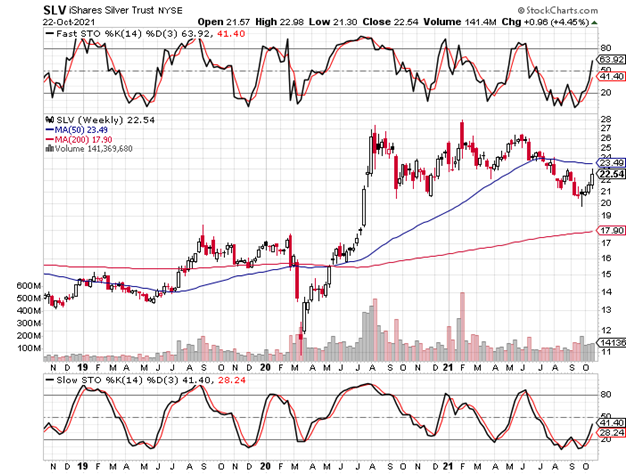
iShares Silver Trust ETF
The May 24, 2022 report also called for a silver low. That report also briefly discussed the SLV’s 200-week moving average:
”A year and a half removed from the explosive 2020 run-up’s peak, the iShares Silver Trust (NYSE:SLV) came within 14 cents of the 200-week (4-year) moving average, suggesting that the long term holders have taken their profits and are out for now.”
As we can see from the chart immediately below, nothing has changed to alter the analysis, though I will add that a flush-out (the sort for which silver is so well known) could take the ETF to a level as low as ~$17.90 ($1.50 lower); apart from this chart, nothing at all has changed from the most recent report’s analyses.
3-Year Weekly SLV Chart
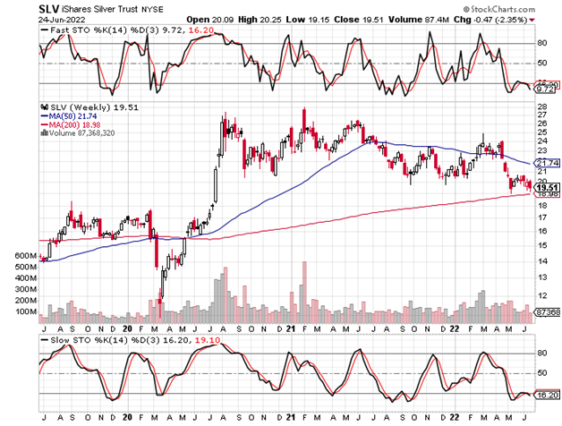
3-Year Weekly SLV Chart
6-Month Daily SLV Chart
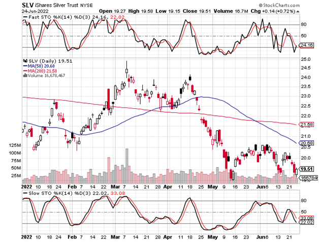
6-Month Daily SLV Chart
Conclusion And Strategy
The daily chart above, including its slow stochastic at the bottom, clearly illustrates why a bottom this week would be very typical of silver’s historic price and time cycle behavior.
From the May 24, 2022 report:
”For an options speculator, I would recommend the SLV March 2023, 25-strike calls around ~$1.28, which was Monday’s closing offer.”
The SLV opened at $20.28 on May 24, 2022. The ETF closed Friday (June 24) at $19.51. The option has slipped since the last report to Friday’s closing offer of 97 cents. Barring something extreme at Monday morning’s open, adding to the position at these levels appears most worthwhile for “reasonable speculators.”
My target for the next wave higher is in the $43 area.