Dow And Silver Bottoms Are In: A Story Of Sentiment

Dow And Silver Bottoms Are In: A Story Of Sentiment

You can also view this article on investing.com which was published on May 24, 2022 01:28AM ET.

Dow

The Dow Jones has bottomed. This conclusion is based on technical analysis and sentiment. Five of the market’s major fundamental concerns are summarized later in this report.

Four decades of experience in technical analysis has kept me level-headed during times of nasty news. That said, let us look at how the news can support a bullish advance and the extent to which it may do so.

The Oct. 25, 2021 report forecast a peak that was only a stone’s throw away, though the breakdown only occurred this year. It was inferential reasoning that had served as the basis on which I had targeted a top at ~36,000.

The explanation was that a 50% collapse that would only slightly make a new low below 2020’s bottom would stop the advance at ~36,000, since major collapses are about 50%.

A minor break of the 2020 low was my analysis 7 months ago, based on the analyses of multi-decade indicators.

Let us look at sentiment and a 5-year chart of the Dow Jones.

Sentiment

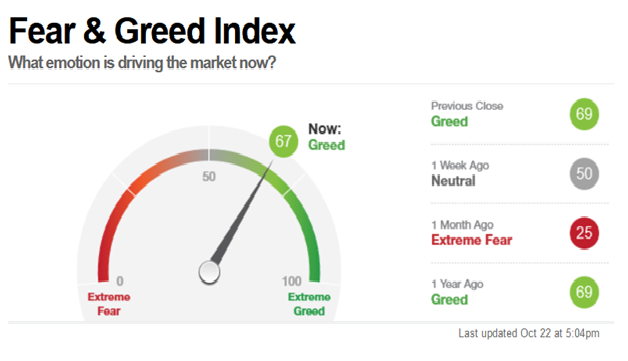
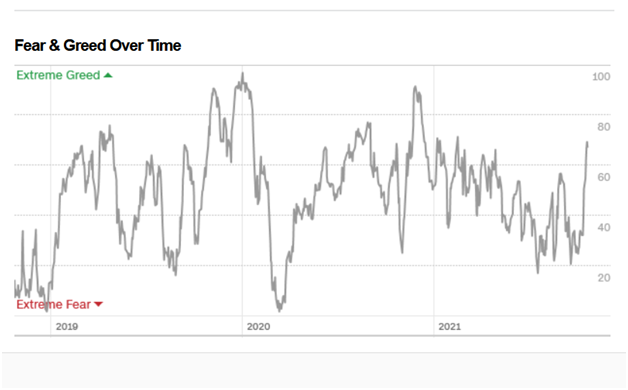
The CNN Fear and Greed Index hit 6 last week, a ridiculous level achieved at the end of 2018 and at the March 2020 pandemic low. In the former case, the indicator did not subsequently peak until the very end of 2019. The bears had been driven through the mud.

After the sentiment indicator’s low in March of 2020, it subsequently topped with the Dow just after the publication of the report that is linked in the 3rd paragraph above (the sentiment indicator had also peaked in late 2020).

Almost everyone who is bullish at this time seems to be saying that the rally will only be countertrend, before again reversing sharply in the face of today’s extensive list of bearish considerations; those factors include inflation, valuations, the reversal of the trend in interest rates, along with the threats of diseases and war rounding out most of the negatives upon which investors may focus.

It would be consistent with both the analyses expressed in the Oct. 25, 2021 report, as well as that scenario that would kill both the bulls and the bears, that the Dow only make a slight new all-time high by about 1%, before collapsing before reversing lower.

The shorts would be mostly out, and the bulls would be suckered into chasing the market to window-dress for the end of 2022’s first half.

Let me be clear about the fact that I am NOT presently projecting any time frame for the collapse to ~18,000. Nor am I claiming that I will necessarily be bearish in any major way as a result of a slight new high in the indices.

A move back to extreme bullishness would obviously help me return to the view that I had 7 months ago and at the peak in 2020. In 2020 I called for a 10,000-point Dow debacle but, this time, I am not yet citing any time frames.

In any event, as regards today’s possible news-supporting positive fundamentals, it could be the end of the affair in the Ukraine, or anything else (other than the Ukraine situation) that could possibly create an idea that inflation is a lesser threat than before; this would create a more bullish outlook for earnings.

An advance to minor new all-time highs in the equity indices could be triggered by any positive news pertaining to the 5 major negative fundamentals that appear in the 3rd paragraph under “SENTIMENT,” above. Such news could set-off the most bullish factor of all at this time, namely, the bears’ stampede to cover their shorts.

Short is what the players indeed are and one need look no further than sentiment, since the latter reflects what investors have already done—not what they plan on doing.

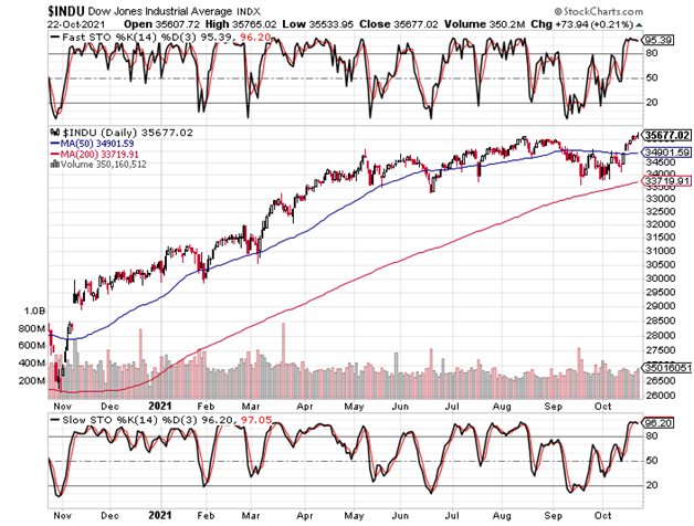
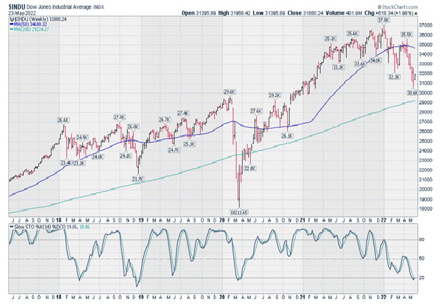
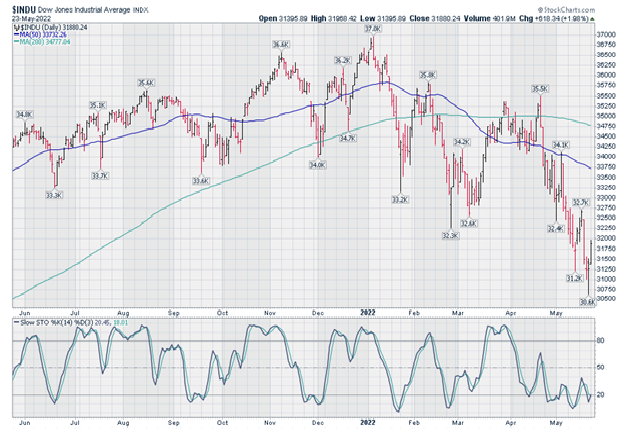
5-Year weekly Dow Jones chart

The fast stochastic (not shown) of the chart is in oversold territory, while the more important slow stochastic joined the fast stochastic in also hitting the 20-level today (under the price’s chart).

The fast stochastic has reversed and is now pointing higher; the slow version below will join the fast stochastic in reversing to point higher, unless the Dow moves sharply higher this week.

In any event, the new low in the weekly slow stochastic is comparatively unimportant; it is the daily stochastic that is much more significant, insofar as divergences and oversold or overbought readings are concerned.

5-Year Weekly Dow Jones Chart

5-Year Weekly Dow Jones Chart

The 200-week moving average has been sufficiently approached, to support the conclusion that long term stockholders have completed their profit-taking for now. Admittedly, however, the 4-year economic cycle does not mean that much anymore, as compared to yesteryear.

1-Year daily Dow Jones chart

As we can see from the chart immediately below, the fast stochastic has already given a buy signal. This is by virtue of its move back above 20 from an oversold condition, after not having made a new low with the Dow.

Regarding the more important slow stochastic, it also slipped under 20 without confirming the low in the market.

1-Year Daily Dow Jones Chart

1-Year Daily Dow Jones Chart

Conclusion

The positives include favorable stochastic in both the daily and weekly charts, coupled with an extreme low in sentiment that is typically seen only at major troughs. Bears could chase the market to new highs, triggered by positive news concerning any of the five bearish factor cited in this report.

Strategy

Respecting that the negatives out there are indeed serious, and given that one can always run into a set of circumstances that may actually be “different this time,” however rare that such an occurrence may be, the “cowardly” course of action will remain the only strategy to which I would ever sign my name. Therefore, that approach is unchanged:

Since 2019, every report has advocated the same all-weather strategy and nothing else. At the perfect low in 2020, the here-linked Mar. 11, 2020 report provided greater detail of the Strategy’s formula.

As the rules-based methodology was developed over a significant period of time, the report focused on how one may seek steady income, within a strategy that aims to provide substantial leveraged protection against sharply negative quarters.

The preceding article coincided with the low in that year’s forecasted 10,000-point collapse. As with today, the report sought to explain how one may proceed when the terrain seems to be so filled with mines, as to make one too wary to move.

Such wariness is unnecessary, if one moves with wisely calculated prudence.

Silver

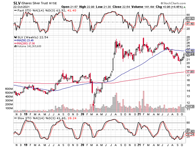
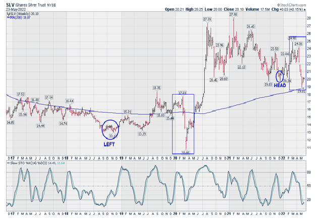
5-Year weekly SLV chart

Note that:

  1. A year and a half removed from the explosive 2020 run-up’s peak, the iShares Silver Trust (NYSE:SLV) came within 14 cents of the 200-week (4-year) moving average, suggesting that the long term holders have taken their profits and are out for now.
  2. The fast stochastic (not shown) is oversold and is now pointing up. The more important slow stochastic is also oversold and also looks like it wants to turn up.
  3. The annotations below indicate how standard technical analysis failed those who lived by inflexible rules. The annotations also imply observations that show how the crowd was, and is perhaps again being duped into selling.

Two periods are compared below, to contemplate if the major players are using the same gimmicks as they did in 2020 to flush-out the market:

4. Please note the circled annotation at the far left on the 5-year chart, “LEFT” (November 2018 – $13.17), which was the left shoulder of a shoulder-head-shoulder formation.

Now please note the rectangular box to the right of the circled low at $13.17. When the chart spiked through the head, which was higher than the left shoulder, and the bottom of which was May 2019 at $13.39, EVERYONE’S sell stops were triggered.

That 2020 spike low ($10.86) was actually the SLV’s right shoulder. There was nothing conventional about either the head or its right shoulder. However, this intuitive interpretation was supported by an analysis of the silver-related stock indices, as well as the stocks themselves.

Now please note the pair of annotated periods at the right:

The left shoulder is $19.83, with the circled head just a touch under $20.00, pretty much matching the left shoulder. By this analysis, we have again busted through the head, while coming within $0.14, as noted above.

5. Therefore, we are again seeing a formation in which the SLV has spiked below the annotated “HEAD” of a reverse shoulder-head-shoulder pattern.

As well, we can see that in the two annotated rectangles, each top-to-bottom move took about 2.5 months to form and complete. Or so, I am assuming.

This chart (SLV’s price action) just loves to fake out the crowd in the most inventive of ways, made possible by the relative thinness of the market when compared to gold, and particularly when also considered in the context of the buying power that the major players can exert when they so choose.

Forty years ago, my mentor taught me that rules should not be viewed rigidly, but, rather, should be used intuitively. In fact, one example that he had given me was that the right shoulder of a reverse shoulder-head-shoulder formation, could be lower than both the left shoulder and the head.

My friend did not have to add that this would more likely manifest in the case of an easier-to-manipulate market

5-Year Weekly SLV Chart

5-Year Weekly SLV Chart

1-Year daily SLV chart

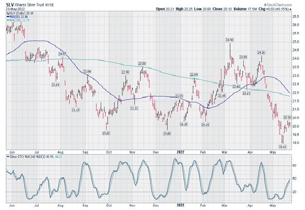
The undesirable aspects about this chart are that:

The 200-day moving average is pointing down, while the 50-day moving average is threatening to cross below it. As well, the fast and slow stochastic have shot up against a backdrop of comparatively little upward progress in the SLV’s price.

As regards the daily and weekly 1 and 5-year stochastic indicators, respectively, an ideal resolution for the bulls would be a minor new low in the SLV’s price, thereby dragging the daily stochastic down, without the indicator making a new low.

This would create a positive divergence that would align with the positives cited above with respect to the weekly chart and its indicators.

However, the market rarely makes it easy and is therefore rarely “ideal,” particularly where silver is concerned. Therefore, the risk and probability is that silver may have already seen its low.

1-Year Daily SLV Chart

1-Year Daily SLV Chart

Strategy

For an options speculator, I would recommend the SLV March 2023, 25-strike calls around ~$1.28, which was Monday’s closing offer.

There are lows that typically take place in the spring and fall, so, if things go wrong at first and one were of the mind to hang on, then one could benefit from 2 bottoming cycles.

This approach would be seeking to improve on probabilities in the aim to reduce risk, particularly since silver is known for explosive volatility when it gets going to the upside.

Note as well that time premiums are low. While the VXSLV data (time premium index on the SLV options) is no longer compiled and therefore does not appear anymore, the GDZ is still quoted. Historically, the two indicators have moved in lockstep.


Dow And Silver Turning Points

Dow And Silver Turning Points

You can also view this article on investing.com which was published on Oct 25, 2021 01:12AM ET.

The Dow and silver turning points have occurred, based on the analyses and clear Elliott Wave annotations and interpretations found in last month’s report, Dow And Silver Trust’s March To Inevitability.

Any short term catch-up in the NASDAQ that would hold up the Dow through month-end would be as insignificant as a possible iShares Silver Trust (NYSE:SLV) retest of the $20 area. In neither case would strategy be affected.

While the un-annotated charts below update those from last month, September’s chart annotations illustrate why I believe we have indeed arrived at major turning points. Last month’s clear wave counts imply the interpretations found in both reports.

DOW

In the case of the DOW or S&P strategy, since August 2019, I have advocated an income-generating program that would benefit from the time-consuming rallies that are typical of bear markets, while being simultaneously positioned for leveraged gains in the event of sharp quarterly declines.

As regards my present market view, last month’s report illustrated the ideal scenario for which to be prepared:

“The proximity to the 200-day moving average and the stochastic divergence are plain and clear evidence of a correction of some sort having ended.

“Disconcerting aspects, however, are found in the speed with which the stochastic is advancing toward overbought and, even more ominously, the equally plain and clear dome formation of the top that has been developing since June.

“This means that short sellers can use tight stops, if fading new highs that could result from manipulation that seeks to drag the last dollar and the last short coverer into the market.”

The updated 1-year daily chart appears below. While it is noteworthy that the secularly bearish interpretation continues to play out perfectly, it is critical to understand that divergences in the daily charts have not yet manifested.

That fact would support a decline and rally back to overbought, though to lower slow stochastic levels that are concurrent with a final high in the Dow (once again by a hair). The latter observation must be taken-in, along with the weekly chart (second chart below) that has already provided the bearish divergence.

Still, the 200-day MA and slow stochastic have more logical applications for the short term, for the reasons explained in the past. All-in-all, then, we must comfortably fall back on the preferred strategy; this allows for being positioned, without needing to be perfect and risk missing the next major decline.

I again call attention to the 2007 peak; this scenario would be perfectly in-line with the scenario discussed above, which contemplates a minor new high that would follow a short term decline.

From the Aug. 11, 2021 report:

“Three notable reports I wrote in 2007 (July 7, October 7, December 2) identified key peaks. If one did not trade, however, the first two of those three reports would have left one the poorer. The 3rd was the charm, bearing the title, ‘2008 Dow Crash’.”

INDU Daily Chart

Again from the September report:

“The 5-year Dow weekly chart appears below. Beware.

“In contrast to the daily chart above which gave a bullish buy signal divergence that crossed over 20, this weekly chart shows a clear and evident sell signal by way of its negative divergence that led to a break below 80!”

“Conflicting signals are consistent with the Dow’s dome formation that is forming and preparing to roll over and fall out of bed, with a floor far below around 18,000.”

INDU Weekly Chart

CNN Fear & Greed Index

Again from last month’s report:

“A spike flush-out, as what we just saw, was perfectly consistent with the Dow charts. The “Extreme Fear” reading (below 20) that had already been achieved suggested that a new spike low was already being discounted.

“Will a minor new high in the Dow coincide with a reading in the “Extreme Greed” zone (above 80)?”

As we can see below, a continuation of the spike to 80+ could be completed by month-end (this week). As previously cautioned, though a low in “extreme greed” may have been (and indeed was) achieved, the spike to “extreme greed” could be swift.

Be ready, then, for a key data point within the unfolding major historic turning point in the stock market.

Fear & Greed Index
Fear & Greed Over Time

iShares Silver Trust

Sept. 27, 2021 report:

“The 3-year iShares Silver Trust (SLV) weekly chart appears below. My interpretation of the price action since the 2020 bottom at $11 is that the “orthodox low” was put-in at $14, while the subsequent Wave-1 peak concluded at $27 in August 2020.”

Last month’s annotations on the 3 and 11-year charts suggested the possibility of a perfect low. An updated but un-annotated version of the latter is linked here. The updated but un-annotated 3-year chart appears below.

The type of chart in the preceding paragraph gives a very clear look at the critical importance of the $20 level that has been repeatedly seen since 2006, either as resistance or support. Coupled with last month’s annotations, we can easily see why $44 is indeed a very reasonable forecast for the next major cyclical rest area.

SLV Weekly Chart

Past reports have examined overlay charts of silver versus gold to display the meaningful potential for silver to play fast and substantial catch-up to its big brother. Since silver doubles as a precious metal as well as an industrial one, the overlay chart of silver versus copper since 2008 (courtesy of Refinitiv, immediately below) serves as corroboration of silver’s exciting potential.

Copper vs Silver Weekly Chart

Today’s conclusion is unchanged from the previous two months, though the strategy update follows.

From the August 11, 2021 report:

“For speculators, the January 20, 2023 $28-strike calls closed yesterday with a bid-ask of $2.43 – $2.48. In the event of a longer consolidation period, I would advise a more aggressive stance at the next entry point.”

From the September 27, 2021 report:

“The option advised for speculators has fallen to $1.31 – $1.35, and I do indeed advise a more aggressive stance as discussed in the preceding paragraph.”

If so inclined, one may add to the position at month-end, this week. If the week moves even 50 cents higher from Friday’s close over the coming 5 days, one can simply hold off from adding.

Ordinarily, this is not the time to add to long positions, cyclically-speaking. Cycle inversions, however, can occur when markets arrive at major turning points. These are NOT ordinary times, so one must contemplate what may occur during such periods.


The Ideal Strategy For Ongoing Substantial Opportunity

The Ideal Strategy For Ongoing Substantial Opportunity

You can also view this article on investing.com which was published on Mar 11, 2020 05:02AM ET.

SPECIAL SECTION: Engineering the Rules-Based Strategy:

How does one concoct the type of strategy that has been recommended in each of the reports since August 2019? This section is dedicated to helping fellow madmen with such engineering.

From the March 4, 2020 report, “Prepping For The Next Wave Lower”:

“To refresh, an appropriate put-combination strategy that is geared for these markets should provide positive results following a positive quarter, while aiming to profit in the 65-95% range after a bear market-style quarterly decline of 8 – 10%.”

Each and every article since the August report linked below, stressed the need to be positioned for a 10,000 point Dow smash with a strategy such as the one above. As we see from the second of the excerpts below, it did not matter if the Dow would continue to rise for the last 4 months of 2019, or if the debacle would have commenced then.

From the August 29, 2020 report, “History Repeating Itself? 1987, 2001, 2008….2019?”

“For the very sophisticated who do not wish to feel that preserving the capital committed to the strategy is dependent on a sharp downturn, an option combination should be devised whereby a positive return is generated as a result of a favorable quarter. Such a strategy would likely include a calendar-price spread, using both long and short put options.”

“With that, one may expect an initial (and possibly yearend) crash to the 16,000 – 18,000 area. Many ought to employ strategies that are not dependent on the latter event. That said, however, be prepared now for precisely such a debacle.”

The recipe’s components:

Generally, a shorter-dated put option is written to gain income that is used to purchase longer-dated insurance. The latter must be engineered to provide substantial leverage in the event of an 8-10% Bear market-style quarterly decline. Meanwhile, the former also serves to generate profits resulting from a bullish quarter. Above all, the engineering must be structured to be weighted to tie the dramatic returns to sharp declines, while only generating moderate profits in the bullish scenario. If one were not so extremely bearish as I am, the engineering would be weighted otherwise.

The mathematical relationship between the shorter-dated and longer-dated contracts should be tied to a rules-based strategy that includes a trigger for realizing dramatic profits after a sharp decline, as well as a rule for actively responding to any decline in the longer-dated put beyond some point, which is price and time-related, in the event of a continued rise in the market. It is important that the longer-dated put maintain sensitivity to market declines, so as to protect against the risk inherent in the shorter-dated leg.

The mathematical relationship between the contracts must provide exceptional downside leverage, which also hedges against any risk assumed by the shorter-dated position. The latter must itself contain a component that hedges against mushrooming losses in the shorter-dated put, in the event of sharp near term declines such as those that we have been experiencing.

The mathematics and ratio are inseparable from the strike prices and expiry dates of the respective contracts and how they are selected. These are inseparable moving parts within the above-referenced mathematical ratio/equation.

Finally, once all the relationships (equations) have been worked out, including the rules-based strategy, the latter must contain a component for determining when to reinvest after realizing dramatic gains. Therefore, the reference to the VIX component immediately below is critical for the management of such a strategy and where we are today.

Again from the March 4, 2020 report:

“Last week’s report reminded that the put program aims to remain invested regardless of whether or not the market is viewed as peaked or bottomed, the exception being when the VIX levels are too high post-liquidation (discussed below).

“Last week’s article explained that the principal consideration in determining the timing for reinvestment after liquidation is the level of the VIX, so as to ensure not overpaying for the newly established combination. For this reason, the report added that the opportunity should present itself early this week (the article wrote “March 1,” which was a Sunday).

“As the chart below reflects, the VIX fell to 25 (24.93) when the Dow crawled over 27,000. The engineering of my own program calls for re-entry on a break of 27.5, so this suggests a newly opened combination. Since we are anywhere but at a peak, the aim of the engineering is to collect income that pays for the protection.”

Historic VIX levels, such as those that we are presently witnessing, make for great income (high near term put prices), as well as protection in the short term, therefore. However, if one were to establish a new post-liquidation position with the VIX at, say, 50, the downside trigger would be hit too quickly and would therefore NOT provide a great deal of leverage to the downside.*

Above, I referred to the relationship (mathematics and the ratio) between the shorter and longer-dated contracts. The mathematics is inseparable from the strike prices and expiry dates of the respective contracts and how they are selected. These are inseparable moving parts within the above-referenced mathematical ratio/equation.

And therein is the rub.

*The mathematical ratio/equation is the basis in relation to which one is to derive the rules-based strategy that adorns and makes functional the relationship and ratio between the shorter and longer-dated put option contracts.

Dow analysis and conclusion:

By making a new low today, however slight, the momentum indicators seen in the 6-month Dow chart below have put in bullish divergences (the slow stochastic below the graph is the more important).

Per the commentary in the first section above, the income and protection strategy is again open, and I assess the overshoot level to which the Dow could now attain to be around 27,250, as opposed to the ~28,100 area cited in the March 4 report, the related excerpt of which appears immediately below.

“The Dow’s correction can overshoot to 28,100, at which point a more aggressive stance would likely be assumed, as was the case at the recent all-time-high.”

INDU Daily Chart

As the 1-year VIX chart below illustrates, it has completed 5 waves up, which is consistent with the conclusion that the Dow concluded a 5-wave decline today.

Secondly, the VIX put in a divergence versus the Dow, which, in and of itself, is also bullish short term.

Thirdly, the VIX’s peak yesterday was the 2nd-highest ever and the greatest since the shocking 90-area in 2008!

In other words, expect that the 10,000-point top-to-bottom debacle forecast in these pages to have transpired with amazing speed in 2020.

Reiterating, the more the authorities tamper with free markets, the worse is the ultimate loss of control. My own view, however, is that the manipulators are the ones making the bets anyway, for many purposes that are not in the public mind. Hence, also as analyzed in the past, often what appears to be a loss of control may be precisely that, an appearance of lost control?

Nothing changes strategy anyway, save for near-term trading, about which, in this case, I do not comment; short term trading is not the concern of these pages since it is highly speculative to make countertrend trades.

Near-term analysis has value for timing pertaining to bearish strategies, but the strategic approach advised in these pages obviates the need to have such concerns.

VIX Daily Chart

Silver (SLV) analysis and strategy:

Gold’s (GLD’s) 6-month chart follows and its momentum indicators have turned down from lofty levels. Moreover, the GLD stochastic indicates a double-divergence that dates to the end of 2019.

The previous reports also discussed the phenomenon of gold actually correcting within an uptrend and that its trend is determined by inferring it from the silver chart.

I explained the counterintuitive form of such analytic interpretation so that one not be shaken out of long term gold positions by sharp declines, such as the $40-60 smash that I expect in the near term; most of that smash could even occur tomorrow (Wednesday March 11).

GLD Daily Chart

Consistent with the contemplated quick ~$50 hit to gold, the 6-month silver (NYSE:SLV) chart below would reflect a bullish divergence in the stochastic if the SLV were to take a violent but quick smash of its own of ~50 cents to a new low at ~$15.25.

SLV Daily Chart

The 8-month VXSLV chart (SLV option volatility premiums) appears below.

From the March 4 report:

“This picture of the SLV’s options’ time premiums explains why options have not been hurt relative to the price decline. The nearly 100% move higher from its 4th quarter low reflects this fact, but it also suggests that there is room for quite a premium hit if volatility were to cool down.”

The VXSLV subsequently shot even higher to complete a more than 100% move from its December bottom.

Today, as one can see, the VXSLV finally got nailed and inflated option prices got hurt. However, it would get much worse with a near term 50 cent smash and another collapse in the VXSLV, which would be helped along by any cooling in the VIX (the stock market’s principal volatility gauge).

STRATEGY

The best way for silver investors and traders to time adding positions would be to use the VXSLV chart below. It should be treated as an asymmetric indicator that should be used to go long additional silver and silver options at a VXSLV level of ~21(i.e. – option prices would be screamingly cheap).

VSXLV Chart

CONCLUSION

Revisiting the August 29, 2020 report, History Repeating Itself? 1987, 2001, 2008….2019?:

“These asset classes’ (stocks and precious metals) asymmetric performance not only represents the very long term norm, but is also the condition by which one could enjoy exponentially increasing profits, owing to an eruption in these asset classes’ volatility premiums from their respective historic lows.”

The VIX and VXSLV have erupted and asymmetric performance is confirmed and growing, all to the spectacular performance of those who followed strategies aimed at profiting from such an eventuality.

Apart from the 2 reports that are linked in this article, hereunder, please find the other 5 reports which are linked below for easy reference. Among other things, they include (a) the forecast of a 10,000 Dow debacle and $10 rise in silver as strong possibilities in 2020, (b) the reiterated forecast to short at a level approaching, but below, 30,000, (c) the explanation that there comes a point when the authorities WANT markets to collapse, so as to provide cheaper prices for the acquisition of strategic assets and, finally, (d) why it is a mistake to believe that the collapse will have taken place solely due to a specific story, such as the virus.

The plausibility of the analyses comes into greater focus when they are taken into consideration jointly, notwithstanding the correctly forecast outcomes. The latter is not necessary to claim proof of the assertions made, though they obviously lend credibility to the different analyses made in these pages, which included an invitation to investors to make certain studies themselves, of proofs of different market phenomena that were provided in previous linked reports.

This is a time for action, and fruitful action stems from study.


Dow Heads Toward 30,000. Here’s The Best Investment Strategy

Dow Heads Toward 30,000. Here’s The Best Investment Strategy

You can also view this article on investing.com which was published on Feb 06, 2020 07:24AM ET.

After a corrective a-b-c pattern (Elliott) to last Friday’s low, the NASDAQ made new highs yesterday, leaving little doubt that the Dow would likely follow suit, as it has tended to do when such instances have occurred in the past. It does not take a seer to forecast that this should occur this week, following-up on today’s catch-up outperformance of the NASDAQ by the Dow.

Almost as predictably, one may have guessed last week that this new high could occur. Here is why:

In 2000 (Sid Klein Daily Fax excerpts at New York Major Turning Points), the game was to blame the decline in January of that year on Y2K. This allowed investors to conclude that the pursuant new all-time-high was proof of the market being problem-free, since Y2K was now acknowledged as being a non-issue.

Similarly, the events of September 11, 2001 were understandably blamed for the sharp decline. Regarding the theme of this market phenomenon in the specific context of 2001, please note the first ever online report, entitled “TIMELY.”

By using only a few of countless examples, the linked reports above provide market participants with the opportunity to do a timely mini-study of the phenomena that has market declines blamed on extraneous events; investors then feel safe to get back into the waters when the market surpasses the level from which the market initially fell.

(Given that the equity markets may presently be at a 2000 or 2007-style summit, I advise taking the time to perform the mini-study.)

This time, the prevailing story following last month’s peak was the Coronavirus.

As opposed to being deceived, if an investor understands the phenomena, one will not be fooled and will instead join the front-running big boys in exiting the market ahead of Dow 30,000, by benefitting from the buying demand created by the short coverers’ attempt to achieve the “headline-grabbing round number.”

NOTE: The phenomenon that is the subject of the above-recommended study is caused by the ever-deceptive Wall Street manipulators, hereinafter known as, “The Short-Coverers.”

From the December 2, 2019 report:

“WARNING: At major cycle peaks, I have cautioned that blow-offs occur to nice round headline-grabbing numbers. In this case, 30,000 is such a number, just as 40,000 was the Nikkei’s number to watch 30 years ago. Included in the warning, note that a fancy number serves a “magnet” that is front-run by smart money.”

As regards the believability of this week’s new highs, please note that silver and gold have remained strong, despite the deepening confirmation of the asymmetric trending that has been unfolding between the precious metals and global equities.

Notwithstanding this article’s forecast and analysis, please note the strategies found in the recent articles’ STRATEGY sections.